“Some Days Are Better Than Others”
This anecdote comes from Understanding Variation: The Key to Managing Chaos by Donald J Wheeler.
Many years ago, David Chambers found the following time series on the wall of the office of the president of a shoe company. Here was a simple and powerful presentation of data in context. The caption on the vertical axis was “Daily Percentage of Defective Pairs.”
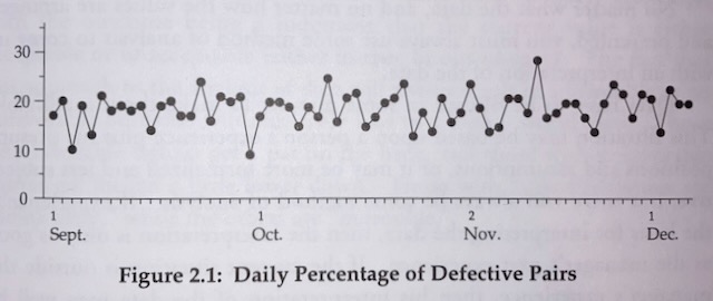
Intrigued, David asked the president why he had the graph on the wall. The president condescendingly replied that he had the chart on the wall so he could tell how the plant was doing.
David immediately responded with, “Tell me how you’re doing.”
Evidently no one had had the temerity to ask the president this, because he paused, looked at the chart on the wall, and then said, “Well, some days are better than others!”
A lot of organisations struggle to understand natural variation. Reports are shown in which lines go up and down. A team has a good month: the line goes up 8%. But then – horror! – the following month it falls 10%. What happened? A bunch of time is spent theorising and explaining, but quite possibly it’s just a case of reversion to the mean, the spike a case of natural variation in contributing stochastic processes.